


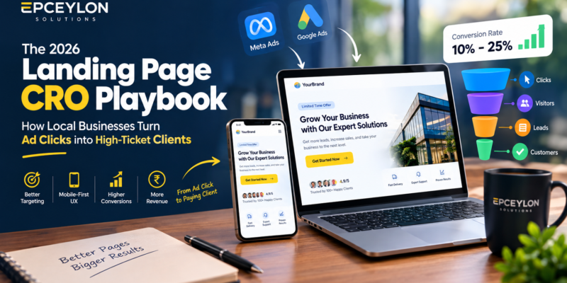
The 2026 Landing Page CRO Playbook: How Local Businesses Turn Ad Clicks into High-Ticket Clients
Every month, thousands of businesses in Sri Lanka and across the globe invest between Rs. 50,000 to Rs. 500,000 in Meta Ads (Facebook & Instagram) and Google Search Ads.
Yet, when you speak with business owners, you hear the exact same frustrating complaint:
“We get plenty of clicks, likes, and dozens of people commenting ‘Price please’ or ‘Details please’, but almost nobody actually books a consultation, requests a quote, or buys our service. Our ad costs keep rising, but our profit margins are vanishing.”
What Went Wrong?
In 9 out of 10 cases, the failure has nothing to do with your advertising creative or your targeting settings.
The breakdown happens the moment the user clicks your ad.
Most businesses make the fatal mistake of sending paid ad clicks directly to their generic website homepage, or worse, to a Facebook inbox where leads sit unresponded for hours.
In 2026, digital advertising is too expensive to rely on guesswork.
To achieve profitable Customer Acquisition Costs (CAC), businesses must deploy dedicated, high-converting landing pages built on proven Conversion Rate Optimization (CRO) principles.
In this playbook, we break down why homepages destroy ad ROI, the psychology of mobile landing page design, and the exact 7-step architecture our team at Epceylon Solutions uses to build landing pages that consistently convert 10% to 25% of ad clicks into paying clients.
1. Homepage vs. Landing Page: The 1:1 Attention Ratio Rule
Why does sending ad traffic to your website homepage fail?
It comes down to a fundamental marketing law known as The Attention Ratio: the ratio of interactive links on a page compared to the number of conversion goals.
Homepage Architecture
┌─────────────────────────────────────────────────────────────┐
│                     HOMEPAGE ARCHITECTURE                   │
├─────────────────────────────────────────────────────────────┤
│ Navigation Menu (6 Links) | Dropdowns (15 Services)        │
│ Slider Banners | Blog Posts | Social Media Feeds            │
│ About Us | Careers | Secondary Contact Form                │
│                                                             │
│ ❌ Attention Ratio = 40:1 (High Cognitive Friction)         │
│ ❌ Result: 95%+ Bounce Rate on Paid Traffic                 │
└─────────────────────────────────────────────────────────────┘
Dedicated Landing Page
┌─────────────────────────────────────────────────────────────┐
│                    DEDICATED LANDING PAGE                   │
├─────────────────────────────────────────────────────────────┤
│ Zero Distraction Header (No Navbar Links)                  │
│ One Problem | One Specific Solution | One Clear CTA        │
│ Verified Social Proof | Transparent Value Proposition      │
│                                                             │
│ ✅ Attention Ratio = 1:1 (Laser-Focused Intent)             │
│ ✅ Result: 3x - 5x Higher Lead Conversion Rate              │
└─────────────────────────────────────────────────────────────┘
A homepage is designed for casual browsing.
It offers dozens of exit doors: header navigation menus, blog links, about pages, and social media icons.
When a paid ad visitor lands on a homepage, they experience cognitive overload (The Paradox of Choice). Unsure of what action to take next, they tap the back button.
A dedicated landing page, by contrast, has a strict 1:1 Attention Ratio.
Every sentence, image, review, and button on the page drives toward a single action:
Book a Call, Request a Quote, or Start an Order.
2. The Mobile “Thumb Zone” Reality in 2026
In Sri Lanka and emerging markets, over 85% of paid traffic from Meta and TikTok Ads arrives on mobile smartphones over cellular networks (Dialog, Mobitel, SLT-Mobitel).
If your landing page is designed on a wide desktop screen and merely “shrunk” down for mobile, you are actively hemorrhaging revenue.
Mobile CRO Rules for 2026
1. The Above-the-Fold Rule
A mobile visitor must understand three things within 4 seconds without scrolling:
- What service do you offer?
- How does it solve their specific problem?
- What action should they take right now?
2. Sticky Mobile Action Bar
Keep a floating, thumb-accessible Call-to-Action button pinned to the bottom of the screen.
For example:
[ 📞 Call Now ][ 💬 WhatsApp Us ]
As users scroll through your case studies, the conversion trigger remains one tap away.
3. Sub-2-Second Load Speed
Over 53% of mobile visitors abandon a landing page that takes more than 3 seconds to load.
Clean HTML/CSS, WebP image formats, and edge server caching are mandatory to prevent ad click drop-off.
3. The 7-Step Anatomy of a High-Converting Landing Page
Here is the exact structural blueprint our engineering and marketing specialists implement for high-ticket service providers and e-commerce brands:
1. The Benefit-Driven Hero Section (H1)
Throw away vague slogans like:
“Welcome to the Future of Excellence.”
Replace them with clear, specific outcomes.
Formula
[Achieve Desired Outcome] + [In Specific Timeframe] + [Without Common Pain Point]
Example
“Get a Custom, Lightning-Fast E-Commerce Website in 14 Days—Without Expensive Monthly Platform Fees.”
2. Immediate Social Proof Banner
Directly below your main headline, place instant trust badges:
- Google Review rating badge, e.g. “⭐ 4.9/5 Rating from 120+ Verified Clients”
- Logos of recognizable local client companies or industry accreditations.
3. The Agitation & Solution Bridge
Clearly articulate the visitor’s pain points before introducing your service as the logical answer.
Contrast the:
Old, Frustrating Way
- Waiting weeks for unorganized developers
- Dealing with broken WordPress templates
with the:
New, Frictionless Way
- Milestone-driven sprints
- Dedicated technical support
4. Interactive Scope & Transparent Deliverables
Ambiguity kills conversions.
Clearly itemize what the client receives:
- Specific features included in the package
- Clear timelines and step-by-step onboarding process
- Transparent starting price or clear qualification tiers
5. Verified Client Case Studies & Video Testimonials
Text quotes can be faked; video testimonials, client photos, and before-and-after screenshots of real analytics dashboards cannot.
Highlight specific business outcomes.
For example:
“How [Client Name] Increased Online Inquiries by 210% in 60 Days”
6. Objection-Busting FAQ Accordion
Every buyer has silent hesitations:
- “What if I don’t like the design?”
- “Do you provide warranty support?”
- “How does payment work?”
Address the top 5 objections directly on the landing page in an expandable accordion to eliminate doubts before they hesitate.
7. The Low-Friction Lead Capture Form
Every extra form field slashes conversion rates by 5% to 10%.
For initial inquiries, ask only for:
- Name
- Mobile Number / WhatsApp
- Service Needed
Avoid demanding lengthy project budgets or physical addresses on the first touchpoint.
Capture the lead first, then qualify them through automated WhatsApp follow-ups.
4. Modern Tracking: Why Client-Side Pixels Are Failing
Even the best landing page will underperform if your ad platform’s algorithm cannot identify who converted.
Due to iOS privacy restrictions, ad-blockers, and browser cookie deprecation, standard browser-based tracking pixels lose between 25% to 40% of conversion data.
When Meta Ads cannot see which users converted, its machine-learning algorithm cannot optimize for your ideal buyers, driving your ad costs higher.
The 2026 Solution: Server-Side Tracking
Meta Conversions API — CAPI
Professional landing pages must deploy Server-Side Tracking alongside the browser pixel.
When a user submits an inquiry, your web server, via webhooks or Google Tag Manager Server Container, sends the conversion event directly to Meta’s servers via the Conversions API (CAPI).
This Achieves:
- Near 100% Event Match Quality: Recovering lost tracking signals.
- Lower Cost-Per-Lead (CPL): Training Meta’s AI on verified paying clients.
- Accurate Attribution: Knowing exactly which ad creative generated real revenue.
Quick CRO Checklist: Is Your Landing Page Ready?
| Element | Standard Requirement | Status |
|---|---|---|
| Attention Ratio | Zero header navigation links; single focused CTA | 🎯 Essential |
| Mobile Speed | Under 2.0s load time on 4G cellular connections | ⚡ Critical |
| Hero Clarity | Problem, benefit, and CTA visible without scrolling | 📱 Essential |
| Trust Signals | Real client reviews, Google rating badge, client logos | 🔒 High Trust |
| Form Simplicity | 3 fields maximum for initial inquiry (Name, Phone, Need) | 📉 Low Friction |
| Server Tracking | Meta Conversions API (CAPI) active with deduplication | 📈 High ROI |
Stop Wasting Your Advertising Budget on Generic Pages
Driving paid ad traffic to an unoptimized website is like pouring water into a leaky bucket.
A purpose-built, high-converting landing page is the single most effective asset to lower your customer acquisition costs and turn digital marketing into predictable revenue.
At Epceylon Solutions, our engineering and digital marketing teams design, build, and optimize high-performance landing pages, custom web applications, and full-funnel tracking architectures tailored to generate qualified leads for your business.
👉 Ready to stop wasting ad spend? Contact our growth team today at https://epceylon.com/ to claim your Free Landing Page & Ad Funnel CRO Audit!
Turn More Ad Clicks Into Real Business
Your advertising budget should not end with a click.
With the right landing page architecture, mobile-first UX, transparent messaging, social proof, frictionless lead capture, and accurate conversion tracking, your paid traffic can be directed toward meaningful business outcomes.
Epceylon Solutions — Building high-performance digital experiences designed for business growth.